This years Future Map exhibition was very interesting.
I don’t think there was a single piece that appeared weak, although not all were entirely to my taste.
I was disappointed in some of the explanations of the work, which were printed in the lovely publication that accompanies the show. I respect how difficult it is to put an idea into words, there is something very disheartening about artists trying to think of a concept postproduction, or explaining their ideas in a convoluted and alienating way. Visually, however, there were some really intelligent artworks, and a lot of innovative uses of materials.
I have chosen my three favourites and written a brief response to each of them.
Sean Lavelle
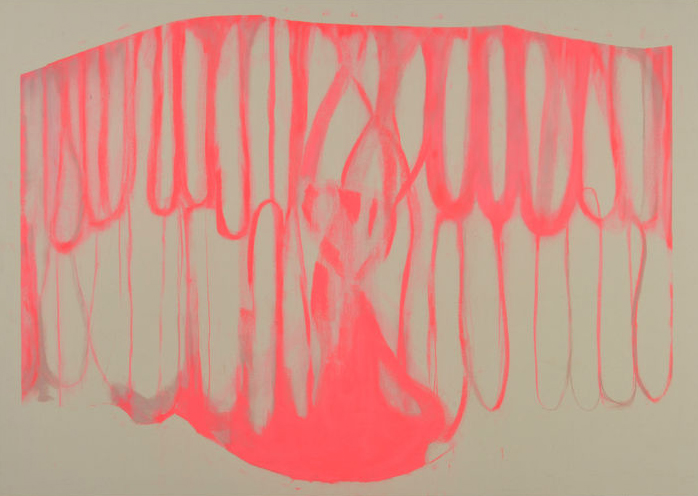
The image above is by Elizabeth Lands and was placed next to the work of Sean Lavelle. I think they actually interacted really well, especially due to the pinks and greens, as well as the organic texture of the painting next to this very structural piece. I liked them so much as a pair I think it is even a shame to separate them.
Sean Lavelle’s piece ‘Ikea Meets The Internet’. On reading the description by the artist I felt they fell short of the works potential. The standard use of the words ‘form’, ‘shape’, ‘colour’, ‘material’ and ‘architecture’ chucked in diminish the creative potential of this work. If we think of it in terms of ‘Ikea Meets The Internet’ I think it is far more exciting. The strange worms which look like squeezed out concrete, the translucent green plastic and the various other details, really look like sculptural clip art, and its structural element means it feels like a weird warped shelving unit. All the different elements against the bare wood create an imaginative power which is compelling, but also weighted, calm and compositionally interesting.
https://seanlavelle.tumblr.com/

Zehra Arslan
Although I was unsure whether the image was deliberately low resolution or accidentally so, I think the effect produced by the slightly pixelated surface worked well within its context. It looks distinctly like an image from Google street view and this successfully placed ‘To Lose The Ground Beneath One’s Feet’ within the context of my experience of digital records of places frozen in time. There is something very pleasing about a work which causes the viewer to really think about how it was made. I don’t want to believe it was photoshopped so I am left feeling baffled by how she picked up all that turf and relocated it so flawlessly, acting like a playful demi-god on April fools day.
https://zehra-arslan.blogspot.co.uk/

Arthur Prior
Continuing on the theme of riddling artworks, it was only on my second walk round the exhibition that I realised this is not a tapestry. It’s an enormous 1:1 scan of one. Even stood with your face 10 cm away you wouldn’t necessarily notice because the image quality is so high and the scan so precise that every tiny fibre and shadow of the threads is recreated. This was done using a custom large-format flatbed scanner, which the artist constructed himself.

‘Tapestry #1’ is conceptually about the artist removing himself from image-making ‘to formulate a semi-automated process of art-production’. However on seeing this process photographed (below) I can’t help feeling his contraption is more interesting than the images produced and that removing the machine reduces the work to something still very beautiful, but a little less impressive.

Another good year for University of the Arts London. As the exhibition is reaching its close have a look on https://showtime.arts.ac.uk/futuremap to see the list of Artists which were included. There are definitely some names to watch, with some inventive use of mediums and overall a very professional finish.
Future Map runs 20 March – 6 April at SPACE, 129 – 131 Mare Street, London, E8 3RH